This past Wednesday, the company I work for announced we were all getting Friday off. And not a furlough day where you get the day off, but also don’t get paid. Nope, just a straightforward extra day of vacation time. A large chunk of the company already lives in various European countries where Thursday was a holiday (Ascension Day) and some countries were already taking Friday off to make it a long weekend. The rest of us would get to join them (those with Friday already off get to pick a different extra day), and of course everybody in the US has Memorial Day tomorrow. So a long weekend for all, and an extra long weekend for many.
If you had asked me what I would do with a sudden extra day a week ago, I suspect my answer would have been that I would knit, or spin, or something to that effect (and that’s what I did on Saturday, to be fair). That is not what I did on Friday. I did a few chores, but most of my extra time on Friday went to…
Building color palettes for this blog and my craft blog. Because that’s totally what I needed to spend time on. I don’t mean just thought “hmm… purple would be nice”. Nooo. I selected primary colors, secondary colors and tertiary ones. And all the primary ones have shades from light to dark, and I’ve analyzed which have sufficient contrast to be used together as text, backgrounds, etc… And I have tidy Word Docs and PNGs with HEX codes neatly recorded (and the WordDoc headings are now in the site colors too). I may have gone a bit overboard in my efforts for our modest little blog.
This, I realized, is what happens when you’ve worked in the Marketing Department and gone through three different brand updates (and all the website updates that come along with rebrands) at work. Something rubs off and I couldn’t help myself.
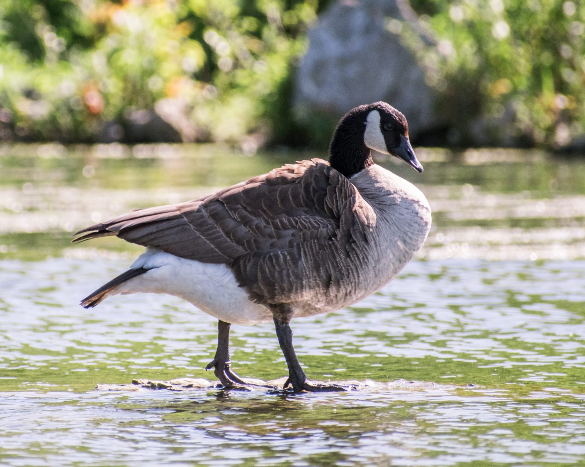
What apparently didn’t carry over (and I really really should know better) is the need to consult with stakeholders first. Aka: the other four of us five geese. I had a lovely palette of greens (grass!), with browns (geese!) and a reddish purple as the secondary color, all picked out when others (very reasonably) pointed out that they too are members of this endeavor, that a green header is not what they would have picked, and they really rather thought that perhaps a purple or a red as the main header would be more attractive. So a bluer purple has been promoted to the primary color, with greens and then browns, as the main supporting colors.
So now, dear readers, you get a consistent blog experience throughout. And because I needed somewhere else to use the colors, I found a gallery plugin so now you can look at all our pretty pictures (with color consistent borders and hovers) in one place:
